
People Person: Your Favorite Downtown Cafe in Mandalay
Designed to help coffee enjoyers to make a reservation at their favorite downtown cafe, People Person.
Class Participant, Goolge UX Professional Certificate

01 Project Overview
1.1 Background
People Person is one of the most aesthetic cafes in Mandalay Downtown. They strives to deliver healthy food, snacks, drinks and Coffee. Prices are ranging in different according to types of food. People Person’s target customers are office staffs, students and people who love to work in a quiet and pretty cafe’ or restaurant.
1.2 Problem
Busy workers and students lack of time to go to restaurant and make appointment or reservation. Even when they are at a restaurant, they have to wait for a waiter to see the menu book and have to think the most suitable menus for the occassion they are making.
1.3 Goal
Design an app for People Person that allows users to facilitate the process of previewing menus, food ordering and making reservation ,and make it feasible in the easiest way possible while maintaing adequate social distances.
1.4 My Role
UX designer, designing an app for People Person Cafe from conception to delivery.
1.5 Duration
3 Weeks, April 2021 ~ May 2021
1.6 Process
User-Centered Design Process

02 Understanding the User
2.1 Empathize
2.1.1 User Research Summary
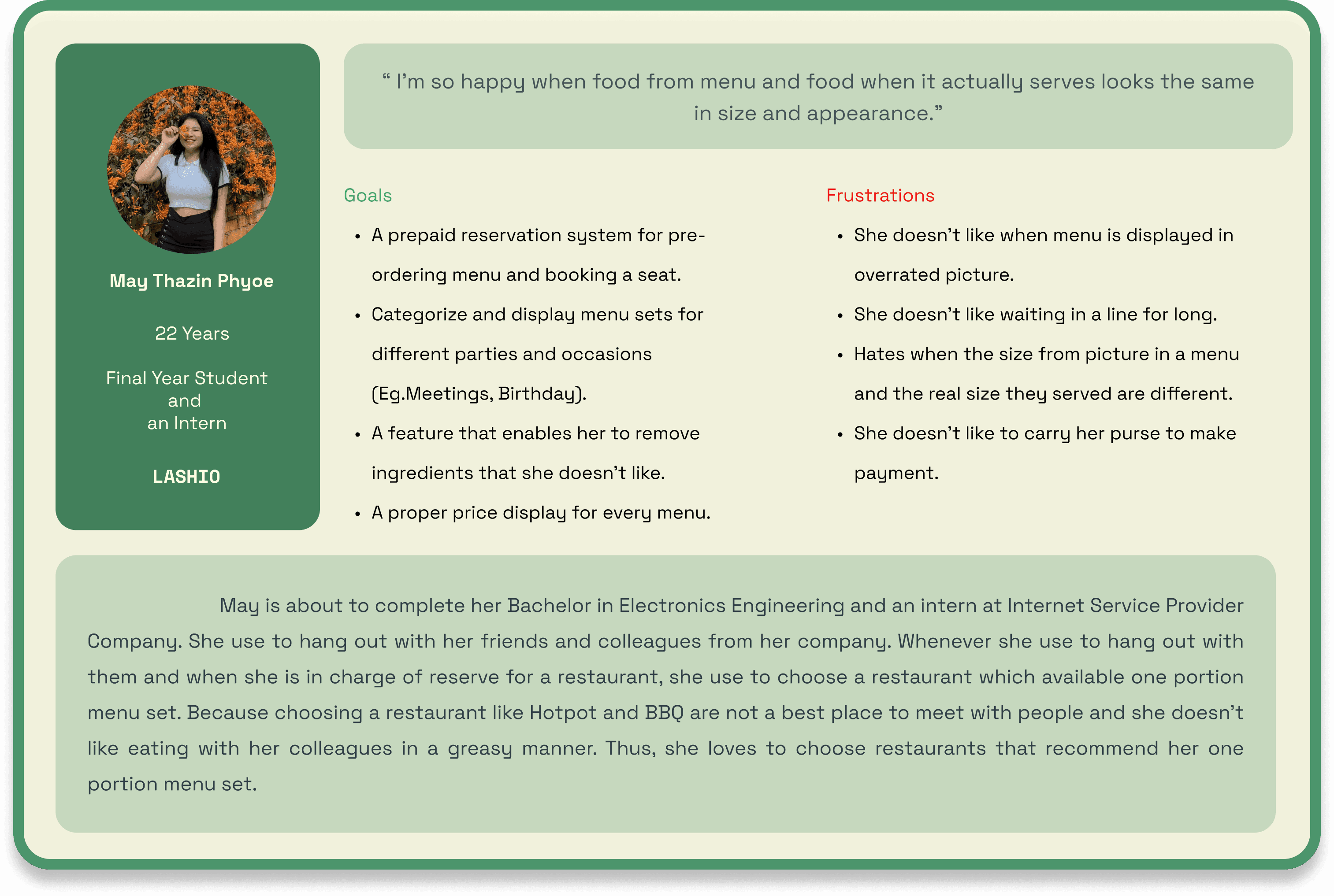
I conducted interviews and created empathy maps to understand the users that I’m designing for and their needs. A primary user group identified through the research was the working adults they don’t want to waste time by waiting for the waiter to make orders.
This user group confirmed initial assumptions about People Person’s customers, but research also revealed that time was not the only factor limiting users from ordering food at the restaurant. Other user problems included that they don’t like to pay with cash as they have to carry a purse and make contact with waiter or cashier. Since Covid-19 become global pandemic, users want to pay with digital wallet and banking systems while maintaining social distances guidelines.
2.1.2 User Research Pain Points
Waiting Time
Users are impatience with waiting for a waiter just to view a menu book and make orders
Payment
Users are inconvenience to carry a purse and make a contact with waiter because of Covid-19 spread.
Processing
Uncategorised menu set in apps are often difficult to order from and to make decision.
2.2 Define
2.2.1 Persona
2.2.2 User Journey Map

03 Starting the Design
3.1 Ideate
3.1.1 Storyboards
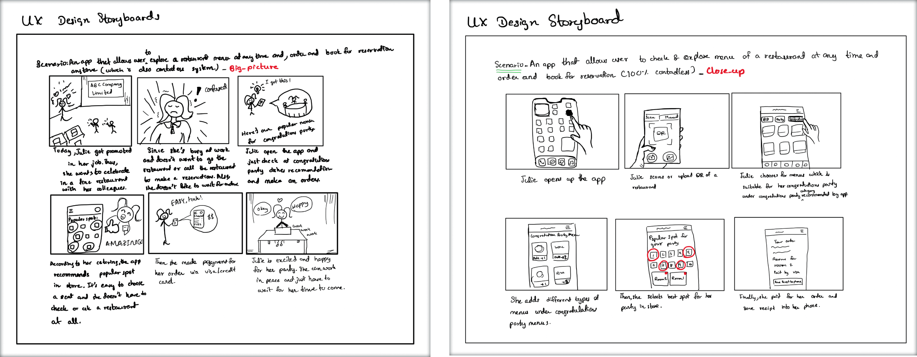
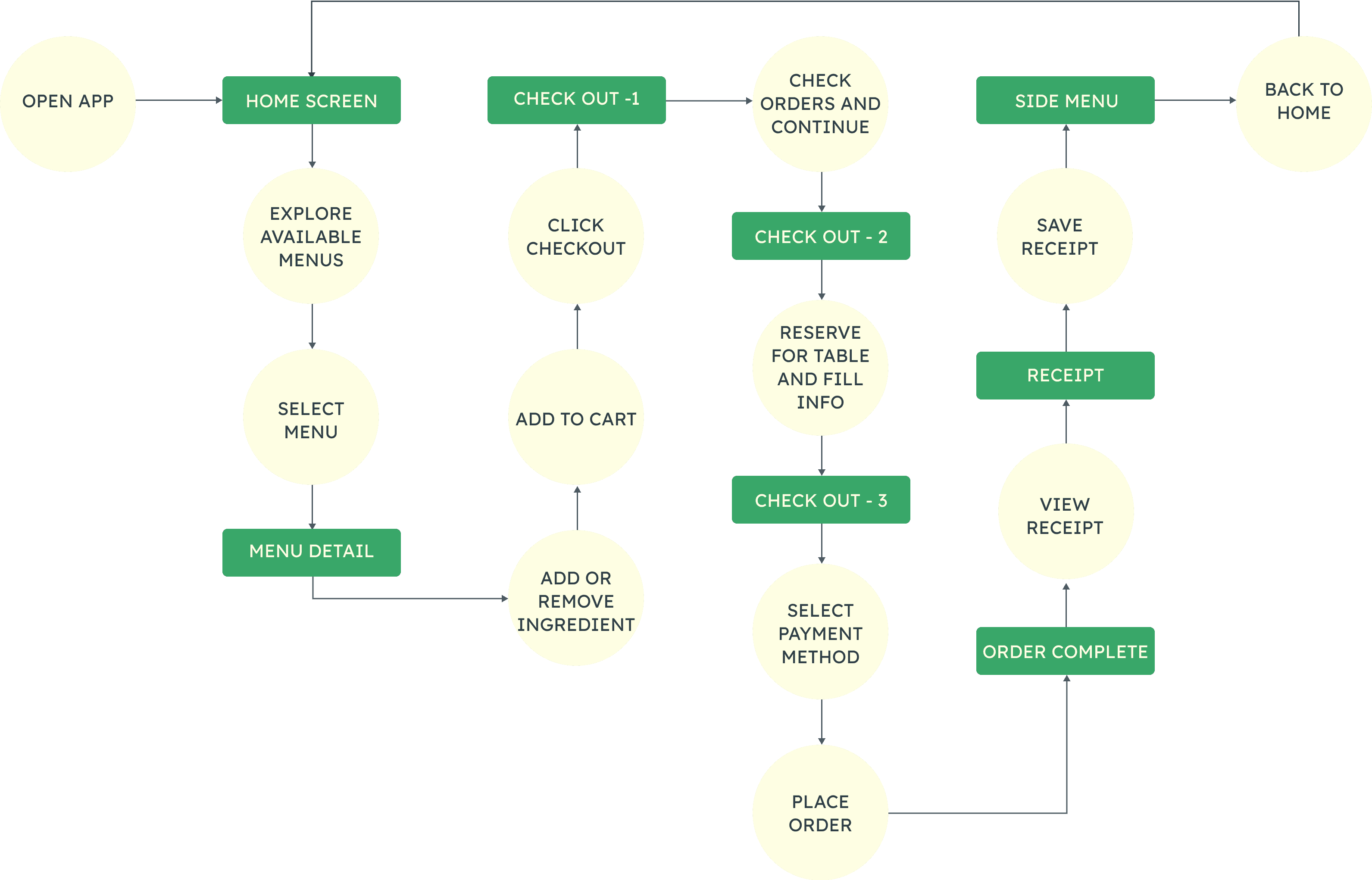
3.1.2 User Flow
3.2 Design
3.2.1 Wireframing
3.2.1 (a) Paper Wireframes
Using the structure of user flow, I drew out sketches of the app’s main features first on paper.
For best approval, I drew 5 sketches for each screen and highlight the parts from from these sketches that is going to apply in digital wireframes.

3.2.1 (b) Digital Wireframes
Using the structure of user flow, I drew out sketches of the app’s main features first on paper.
For best approval, I drew 5 sketches for each screen and highlight the parts from from these sketches that is going to apply in digital wireframes.
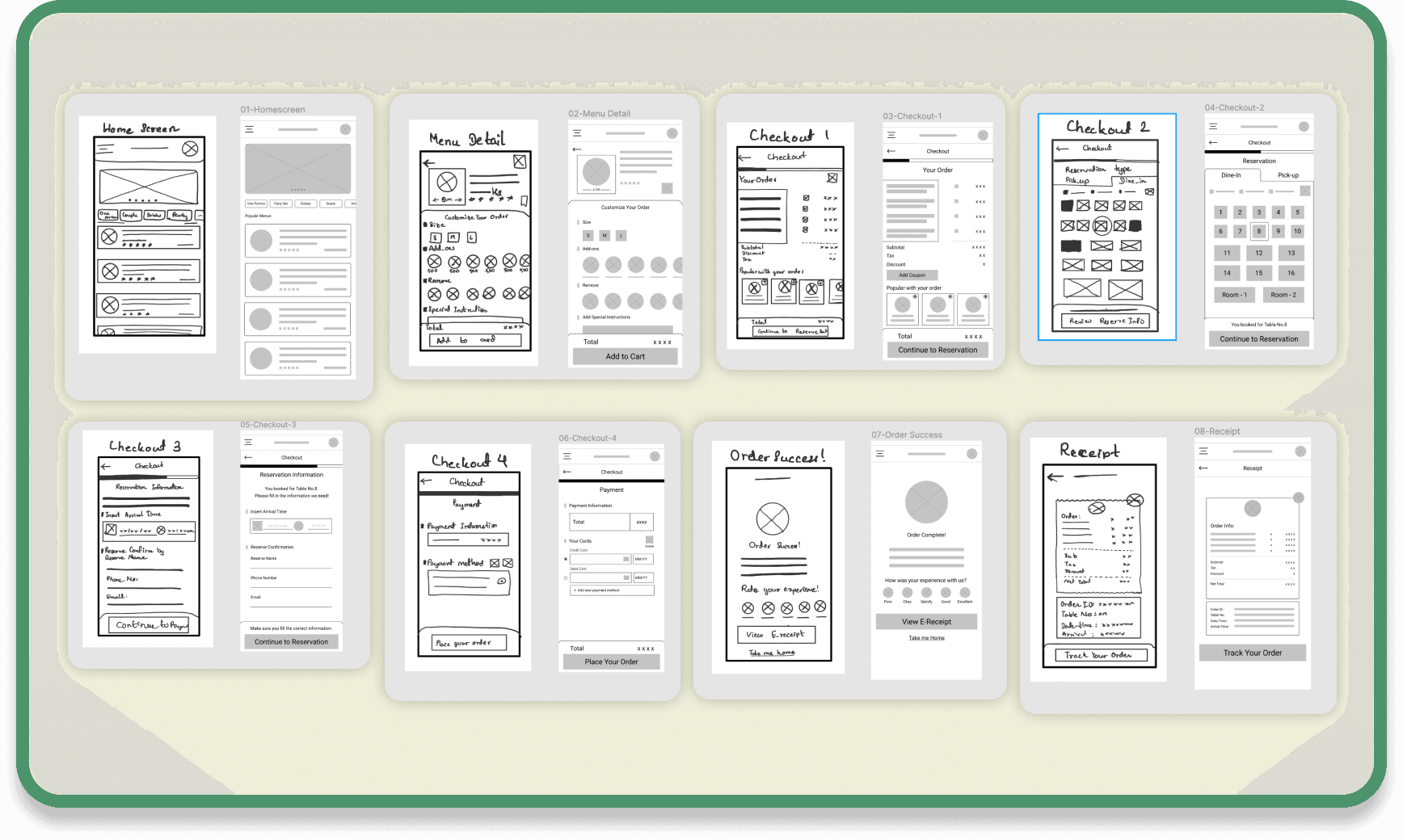
After that, I created an interactive Lo-Fi prototype of the screen in order to test the usability of the application.
3.3 Test
3.3.1 Usability Study

3.3.2 Usability Study: Parameters
Study Type
Moderated Usability Study
Participants
5 participants
Location
Mandalay, Remote
Duration
25-30 minutes
3.3.3 Usability Study: Findings
These were the main findings uncovered by the usability study:
Clarity
People can’t find how many items was added to cart.
People didn’t notice how’s the payment method changed.
Efficiency
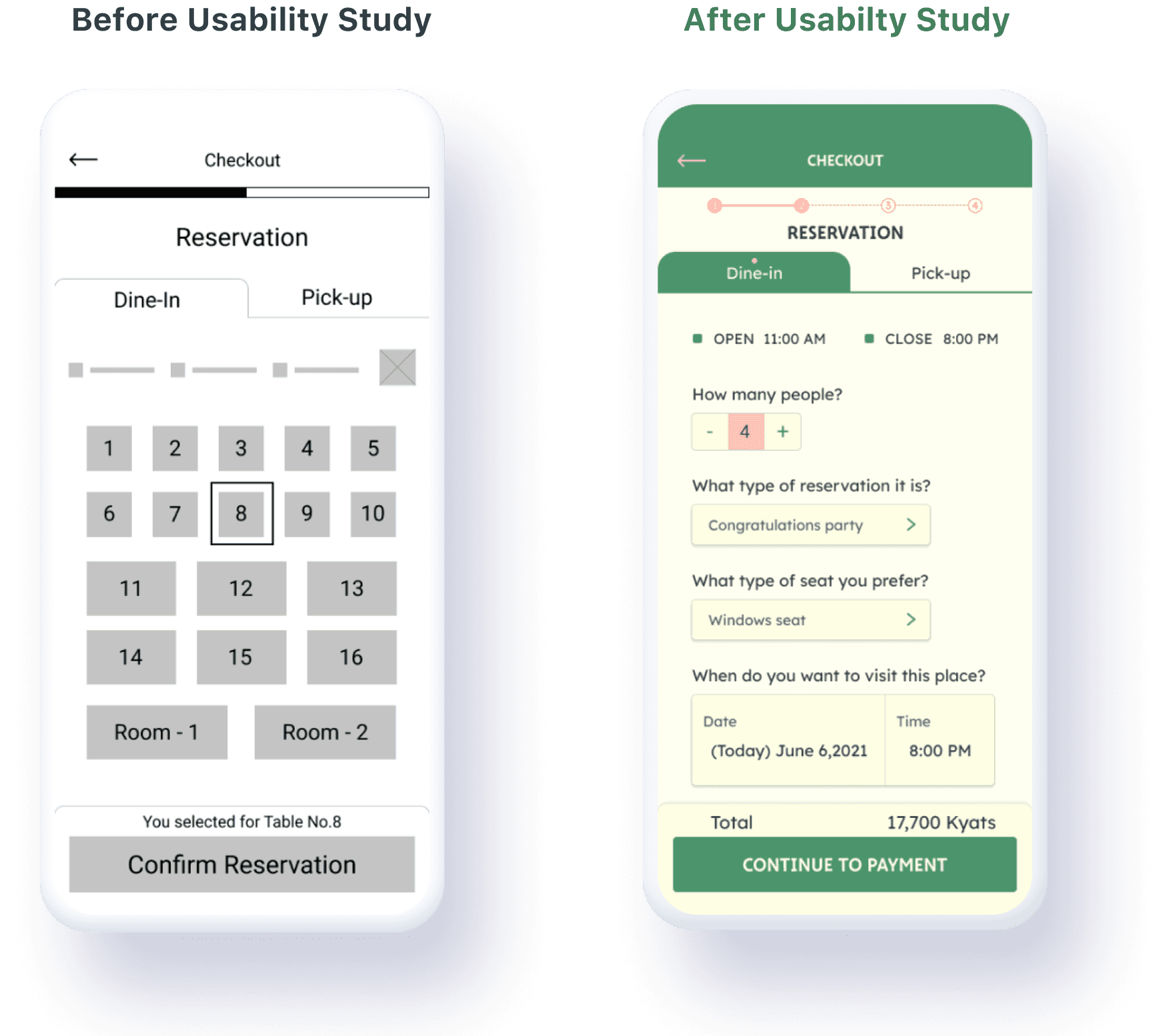
People to see all necessary information for reservation in a single page.
Processing
People don’t like to give a rating by a force.
People think E-mail is not a good option to ask for reservation in Myanmar.
04 Refining the Design
4.1 Redesign
4.1.1 Mockups
There were a few actionable insights I came up with from the usability studies. One of these was making a reservation form which suggests popular seat types in a shop instead of a seating plan to help users from making a hard decision about choosing a seat.
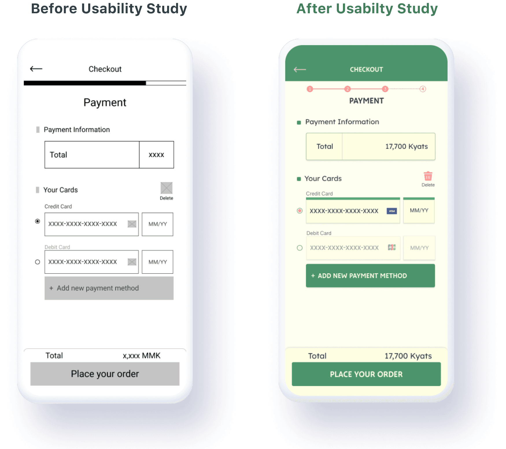
The early design shows unclear display about the current payment method that user is going to use, but after the usability study, I added the active bar and state more distinct to current payment method selection. This gives users the ability to notice which payment method they are going to use.
4.1.2 Final Visual Designs

Home Screen
Menu Details


Side Menu

4.1.3 Final Hi-Fi Prototype
The hi-fi prototype followed the same user flow as the lo-fi prototype, and included the design changes made after the usability study.
Lessons Learned
While designing the People Person’s app, I learned that the beginning steps for the app are the true foundation of all the processes that was going through.
Starting from personas, usability studies and peer feedbacks influenced each iteration of the app’s designs.
This is just a beginning phase and learned that the design process cannot always go in linear.